color psychology in branding
colors don't have universal meanings. context and culture shape everything.
the myth of universal color meanings
red doesn't mean passion everywhere. in some places it means luck. in others it signals danger. the same color can mean opposite things depending on where you show it.
white means purity in western weddings. it means mourning in parts of asia. blue means trust in finance. it means sadness in music. context matters more than the color itself.
what colors actually do
colors create differentiation. if every competitor uses blue, green makes you stand out. that's not psychology. that's contrast.
colors trigger associations. if you grew up seeing orange on construction signs, you associate it with caution. not because orange is inherently cautious. because you learned that pattern.
stop looking for universal color meanings. they don't exist. what matters is how your audience interprets color based on their experience and culture.
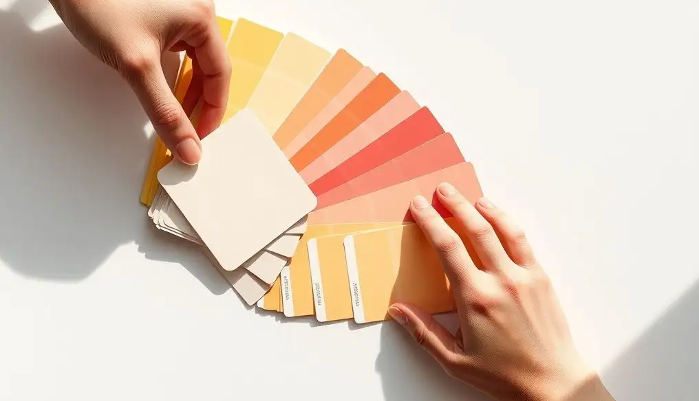
picking colors that work
start with your competitors. what colors dominate your industry? if you want to fit in, pick something similar. if you want to stand out, pick something different.
consider your audience's cultural background. what do these colors mean where they live? what brands already use these colors in their market?
test legibility before meaning. can people read your text? does your color scheme work in different lighting? functional beats symbolic every time.
consistency beats psychology
the best thing you can do with color is use it consistently. same shades, same applications, same combinations every time.
over time, people will associate your colors with your brand. not because the colors have inherent meaning. because you used them consistently enough to create that association.
that's the real psychology of color in branding. repetition creates meaning. consistency builds recognition. the specific colors matter less than you think.